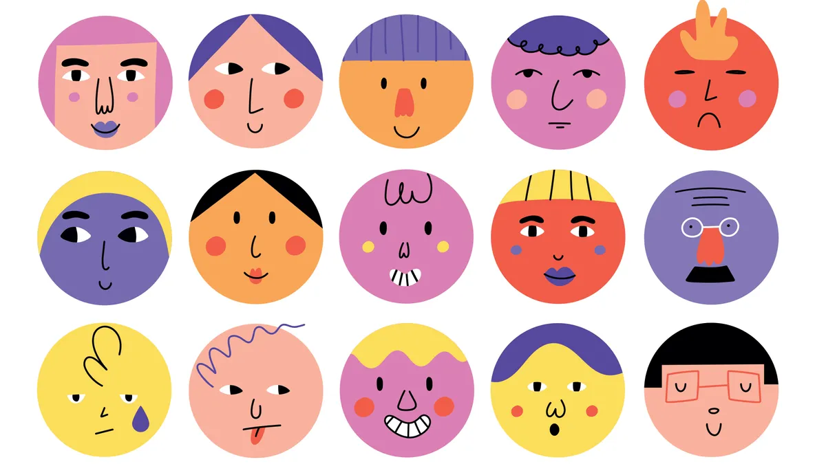
33 expert character design tips By Rosie Hilder last updated 21 March 24 Character design Leading artists and illustrators share their character design tips.
6 tips for using logo grid systems for successful design By Niall O'Loughlin last updated 21 August 23 Logos Logo grid systems, construction guides and circles are powerful techniques for creating a design.
Colour theory: A jargon-free designer's guide By Sam Hampton-Smith last updated 7 June 23 Graphic Design Everything you need to know about colour theory.
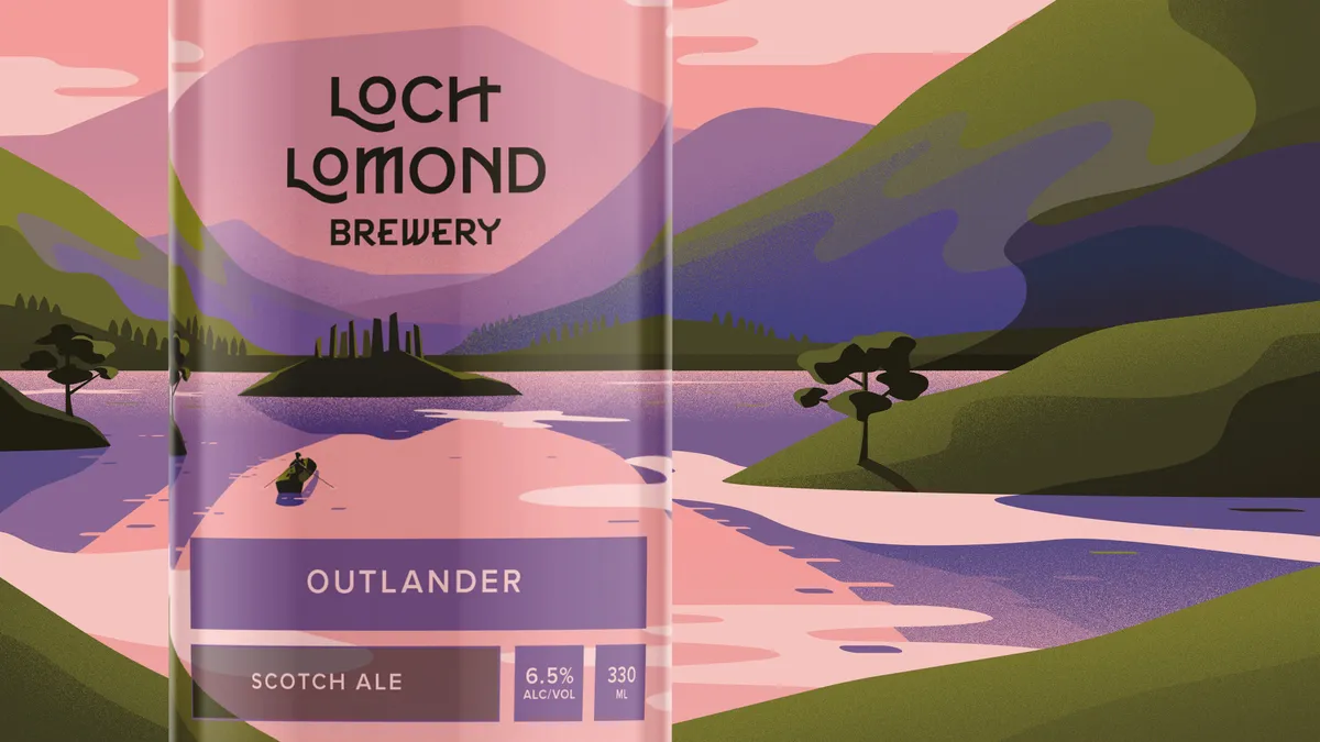
39 standout packaging designs By Rosie Hilder last updated 18 April 23 Packaging Inspirational packaging design examples, plus online resources.
Why it's time for designers to stand up as creative activists By Steve Vranakis last updated 14 October 22 Opinion Designers are more powerful than they think they are.
How to succeed as a designer-maker By Lisa Hassell published 25 August 22 Graphic Design Your guide to creating and selling your own products.
10 tips for a killer design portfolio By Luke O'Neill last updated 23 August 22 Portfolios Top tips for creating a winning design portfolio.
How to shoot print work for your portfolio By Tanya Combrinck last updated 23 August 22 Photography Showcase tactile projects with more effective photography.
Designers react to the Mastercard rebrand By Nick Carson last updated 23 August 22 Branding Pentagram's evolution of the iconic Mastercard brand gets put under the microscope by three design experts.
We loved these gadgets in 2014 (but where are they now?) By Creative Bloq Staff published 11 August 22 Inspiration For our 10th anniversary, we revisit the last decade of design.
10 controversial ad campaigns of 2013 revisited By Creative Bloq Staff last updated 9 August 22 Branding Some people hated these ads in 2013 – but what's your view of them now?
7 top tips for starting your own business By Lisa Hassell last updated 4 August 22 Career Design pros share their business pearls of wisdom.
Incredible art brings Darth Vadar to feudal Japan By Tom May last updated 11 July 22 Computer Arts This incredible design was created as a 18x18in woodblock printed on 20x26in rice paper with deckle edge
7 huge animation trends of 2020 By Lisa Hassell last updated 20 June 22 Animation Industry pros explain what's hot in animation.
Bring a brand to life with illustration By Emily Gosling last updated 1 April 22 Illustration We explore how illustration can transform a brand.
How to use digital tools to create a hand-drawn look By Claudine O'Sullivan last updated 1 April 22 Illustration Pro advice for sketching using an Apple Pencil and iPad Pro.
5 things clients really want (but probably won't tell you) By Creative Bloq Staff last updated 24 March 22 Career The hard-won secrets of keeping design clients happy.
How to run a more efficient studio By Nick Carson last updated 24 March 22 Graphic Design Advice from leading studios on how to manage a busy workload.
How to start a design business: 9 tips for success By Lisa Hassell last updated 14 March 22 Design Discover how the pros got up and running.
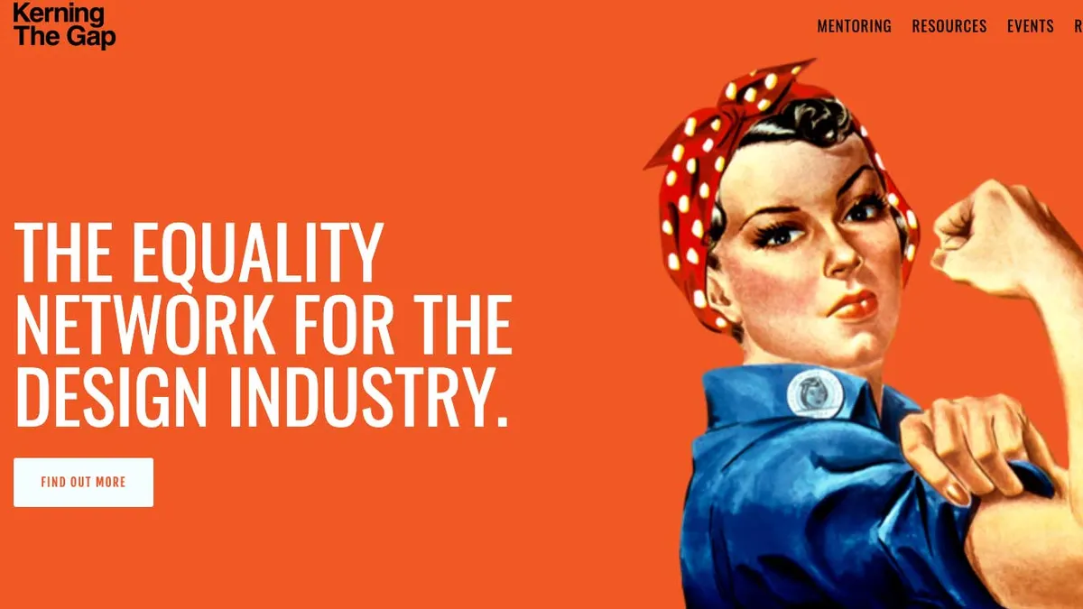
Design's gender problem, and what you can do about it By Rosie Hilder published 8 March 22 Design We explore how you can address gender inequality in design.